Building Intelligent Track Systems first design system in collaboration with various airports across Europe.
My role
UI design, button, logo, icon, typographi
UX design, autoethnographic testing, UX audit
Stakeholder management
Workshop facilitation
UX critique sessions
Results — so far…
Building trust between developer and designer
Educating programmers in using Figma as a guide for development
Big ‘thumbs up’ from varying airport-partneres when presenting the new and updated look of our application
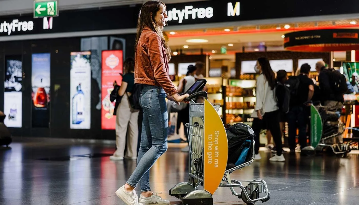
The new design system needs to bring the brand identity of ITS into the 21st century, while reducing time-to-market in newly aquired airports.
Besides my main tasks of UX research/testing, product implementation/optimization and IPS-mapping, I have begun building ITS’ first design system. While it takes time to process applications for installations in new airports, the process of making our app ready has become slower as we have developed more features. The reason we can’t copy-paste our iterations from one airport to the next, is because each application is tailored to fit the airport it operates in.
To accomodate this, it has been decided to smoothen the process of building new applications for newly aquired airports. Part of this comes down to creating a solid design system that can be altered to fit each airport and its individual rules of advertisement, colors and tracking. I have managed to partner up with innovation teams across airports of Europe to get insights into cultural expectations and feedback as I design the system.

What we have achieved so far…
Phase 1) Discovery & Planning
Audit existing UI & patterns
Collect and analyze current components, visual styles, and inconsistencies across products ✔
Stakeholder alignment internal and external
Defining achivements within ITS ✔
Define the scope/scale within ITS ✔
Defining achievements with MUC/HAM/BRU (airports) ✔
Discuss priorities with Emaratech
Discuss order of realease with Emaratech (components, tokens, guidelines)
Create a roadmap
Make a roadmap and align with MUC/HAM/BRU/Emaratech ✔
Phase 2) Design & documentation (3–6 weeks)
Accessibility foundations
Contrast ratios, focus states, navigation ✔
Establish design tokens
Colors, typography, spacing, etc. ✔
Create token library in Figma
Accessibility foundations
Contrast ratios, focus states, navigation ✔
Make a accessibility checklist ✔
Design components in Figma
Buttons, new layouts, cards, navigation, look ✔-30%
Variants, states, responsiveness, auto-layout
Document guidelines within Figma
Do’s & don’ts
Accessibility considerations ✔
Content rules
The challenges of building a design system with a team that has never worked with design systems.
When I first joined ITS, I learned that our developers from Emaratech had a completely different approach to co-development than I was used to. To boil it down, the work culture in Saudi, is top-down to an extreme, where you are not expected to ask questions. You are supposed to deliver on request. As one can imagine, this makes co-developing between a UXer and a programmer very difficult. Before I learned about the gap, we had many misunderstandings and issues, because they did not question my requests. However, I made it my mission to build trust and confidence by actively involving them in the desing process — both by loosening up the existing relation and by asking them about recommendations and suggestions throughout the process. These activities has played a big part in the development processes becoming more smooth with less misunderstandings, while making the programmers from Emaratech much more invested in our products and processes.
When I joined ITS, Emaratech used PNGs as blueprints to develop. This was a standard of how they would develop features. However, this resulted in an app with an overall varying style of spacing, font sizing, etc. In some of my tests, our users has pointed out the lack of coherrence in our product, calling out the variation in style of icons, text and fonts. Moreover, we found that each design had seperate tokens, making the application file size way higher than it could be. As a part of implementing Lean UX in our processes, I introduced the team to Figma and to how you can use it as a developer to see margins, spacing, fonts, etc. Before building the new design system, we made tokens and components on the existing application in order to educate our developers in developing front-end using a design system.
Auditing existing UX/UI and discovering usability patterns
To create a baseline, while getting to know the performance of key UI functions and overall usability of ITS’ current software, I made a classic usability testing framework with missions to be completed. To review the performance all hand gestures and facial expressions has been recorded, to analyze and review pain-points. As our main users (80%) are mainly 30-50 y/o, we have chosen to test this group of mixed European cultures of all genders. The group tested also was interviewed to spotlight potential details we would miss when analyzing inputs and expressions.
It was discussed whether or not to test in airport settings — either by creating an airport setting at a mall/studio og by testing on travellers. Since the goal was to get create a usability testline, it was decided that we kept the distractions and variations to a minimum. We are currenly testing our old system…